
Bringing home a new brand Refining the identity of a property management company


Overview
Metropolitan Management Corporation (MMC) is a property management company with over 3,000 residential units in Pennsylvania and New Jersey. In business for over 30 years, MMC owns over 20 apartment complexes and provides management for shopping centers, offices and smaller retail spaces.
Challenge
Metropolitan Management’s brand lacked cohesiveness. Each of the 20+ complexes had its own name that held no connection to MMC. Likewise, the signage did not reflect the MMC brand mandate to convey the unified feel of a friendly community. The URL, mmcrent.com, felt impersonal, and too corporate. We were challenged to solidify their brand and refine their identity.
Solution
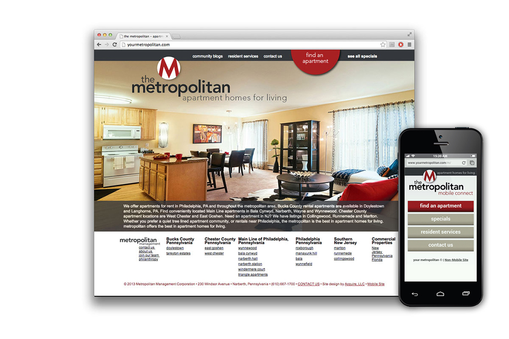
NAMING: We began by changing the corporate name to The Metropolitan – adding the tagline “Apartment homes for living.” We developed a property naming convention to connect the company name with the building location.. Fairways Plaza became The Metropolitan | Wynnefield, Abbey House became The Metropolitan | Manayunk Hill and so on. The URL was changed to yourmetropolitan.com to reflect their personal approach to property management.
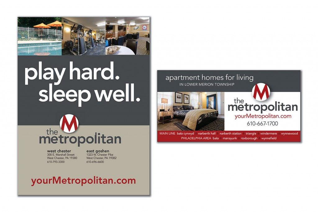
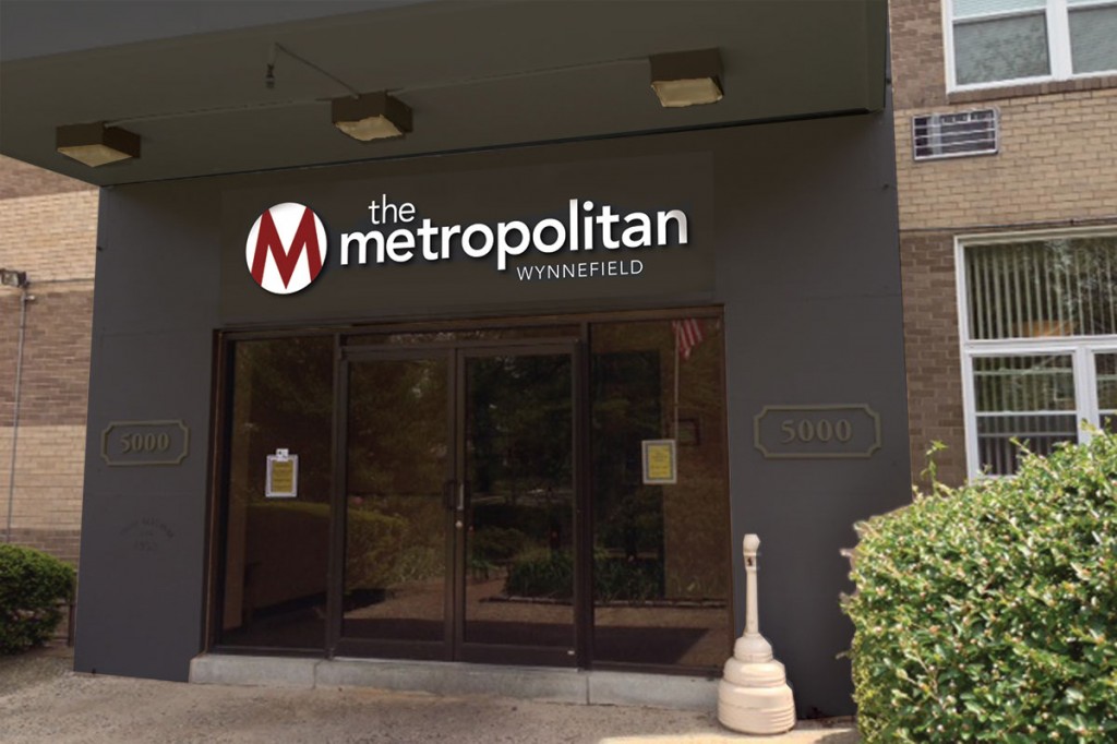
CORPORATE IDENTITY: We designed a logo that centered on a strong, recognizable “M” graphic. We changed the corporate color from a cold blue to a rich red that stands out on their signage. We paired the red with the neutral secondary colors gray and beige. These secondary colors do not compete with the red, do not conflict with building colors, and do not impede photography.
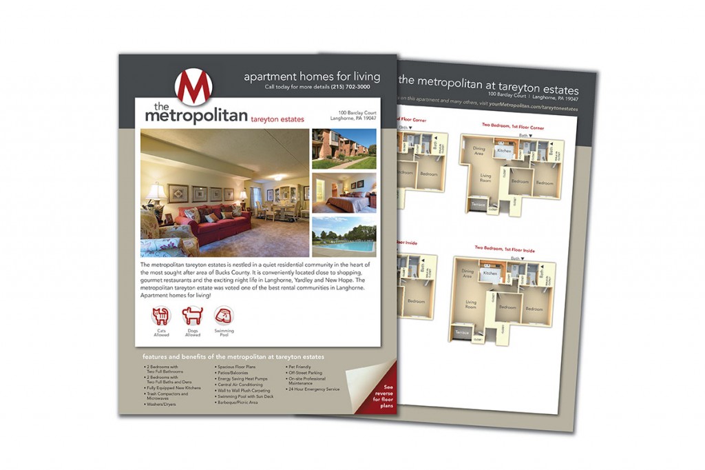
We then applied this new identity to everything from stationery to brochures to staff uniforms. We designed exterior signage that reflected their brand, stood out in the environment and is easily scalable based on individual municipality size requirements. For some properties, we were able to carry the identity through to the physical building through repainting select accents.
ONLINE: In redesigning the website, we focused on beautiful photography and clear pathways to navigate finding an apartment. We developed a simplified mobile version of the site that is easy to use on a phone without sacrificing content.
OUTCOME: a clear, cohesive brand that connects the properties and communicates the approachable and homey feel that Metropolitan Management Corporation needed. All communications, every building and street level sign, their trucks on the road and their uniformed staff now connects and promotes the entity as a whole.
A fetching new identity Taming the brand of a pet supply retail store
Overview
Buzzy’s Bow Wow Meow is a retail store and pet grooming salon serving the Main Line and nearby suburbs of Philadelphia. They have been in business for over six years and have strong connections to animal welfare organizations. They host seminars and adoption events along with their retail operation.
Challenge
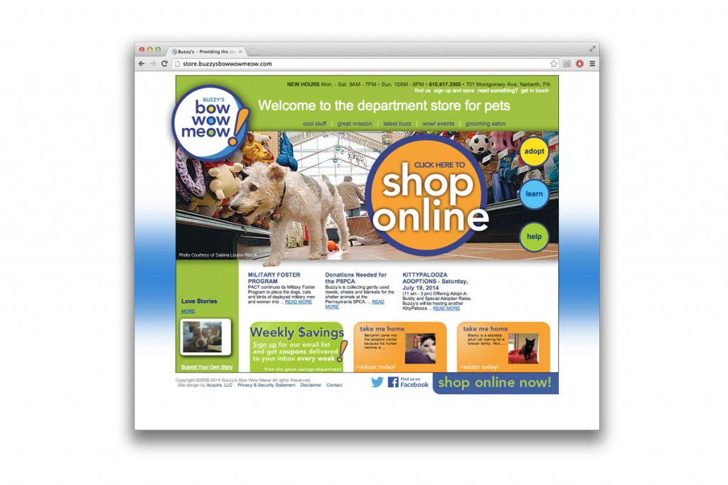
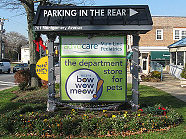
Buzzy’s built a beautiful retail space – and when they opened their doors, they had developed a logo, some basic signage and not much else. Their logo did not clearly convey that they were a retail store, and they had no web presence to promote the store or in-store events. Communications confused the connection between the retail store and the non-profit alliances. There were several taglines in use and four different brand colors with no standards for presentation. The store is located on a busy road and intersection, but their building is set back, and their monument sign blended into the environment.
Solution
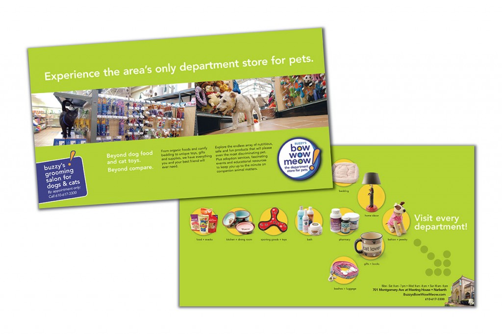
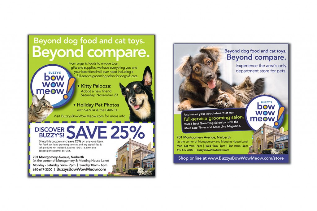
CORPORATE IDENTITY: We began with a redesign of the logo – with a focus on bright, colorful, fun and clean. We then developed a tagline that directly reflects the Buzzy’s experience. The store is neither a big, anonymous box store nor a small boutique. But it does offer virtually anything a pet owner seeks, from collars to gluten-free treats to meticulous grooming, delivered by an expert staff who truly wants to help. “The department store for pets” quickly and clearly conveys this brand promise. We established the distinctive green cornerstone color and integrated it consistently in all communications, including primary street level signage.
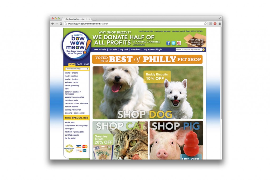
ONLINE: We then designed the store’s retail web site. With a focus on news and events, promotion of in-store pet adoptions and a strong social media presence, this site is more than just an introduction to the store.
As the retail operation grew, we worked closely on strategy and logistics to launch an online store. We connected their existing internal point-of-sale software database with an online shopping cart. This e-commerce site boasts over 3,500 products and features an easy-to-use content management system, customer sale history, integrated shipping and frequent buyers programs.
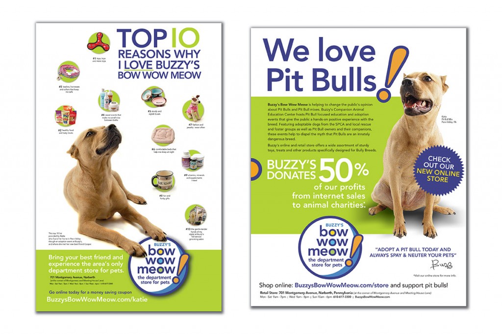
MEDIA: We created an ad series to highlight great product selection and underscore brand identity. We developed email blast templates to promote special sales and events that staff could easily update and distribute.
In conjunction with the advertising, we designed a series of postcards to promote the grooming salon, convenience of location and again, excellent product selection.
OUTCOME: a unified brand that reflects the Buzzy’s shopping experience. We connected the animal welfare without overshadowing the retail component. We helped to put them on the map with a clear and memorable identity, both in store and online.
Prepared for concrete results Mastering the communications of a construction chemical manufacturer

Overview
Vexcon Chemicals is a manufacturer of chemicals for the improvement of concrete. Located in Philadelphia, they sell nationwide to individual contractors, designers and architects, as well as supply material for large scale transportation projects. They have numerous products and trade names and provide premium products with advanced chemistry and industry-leading warranties.
Challenge
Vexcon had traditionally approached selling products with a one-size fits all approach. Their sales materials and organization of information did not take into account their varied types of buyers. Within the industry, the knowledge and experience with concrete building products varies widely. The desire and needs of the architect who wants to enhance the beauty of concrete is different than the purchasing agent who specs a concrete curing compound to speed up concrete work on a bridge project. With over 220 products to choose from, identifying the buyer and quickly matching them with a solution was paramount.
Solution
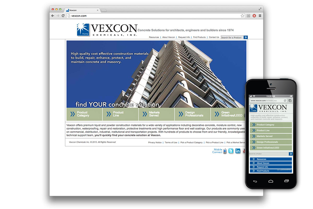
ONLINE: We began with an overhaul of Vexcon’s web site. The site and database of products would become the backbone of Vexcon’s portfolio of products. We organized products within the database and created a navigational scheme that allows the user to browse product by use, market and specific product line, as well as targeted solutions for architects/designers and those seeking LEED qualifying material. If a contractor knows what they need, they can quickly locate information. If a designer wants to explore options that are available or a purchasing agent needs to meet state-by-state requirements for VOC restrictions, the web site quickly connects them to that information. Beyond finding products, the site supports the user with installation notes, material safety data and warranty documentation. Recognizing that some users are in the field, we customized the site to be extremely easy to navigate on mobile devices.
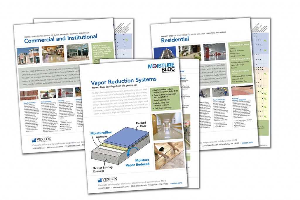
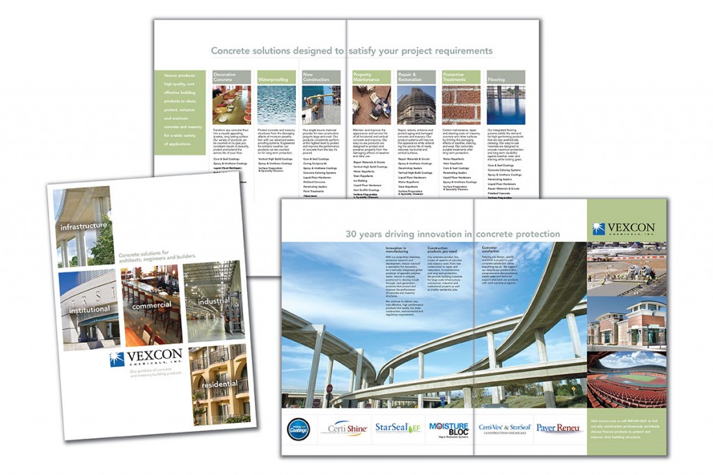
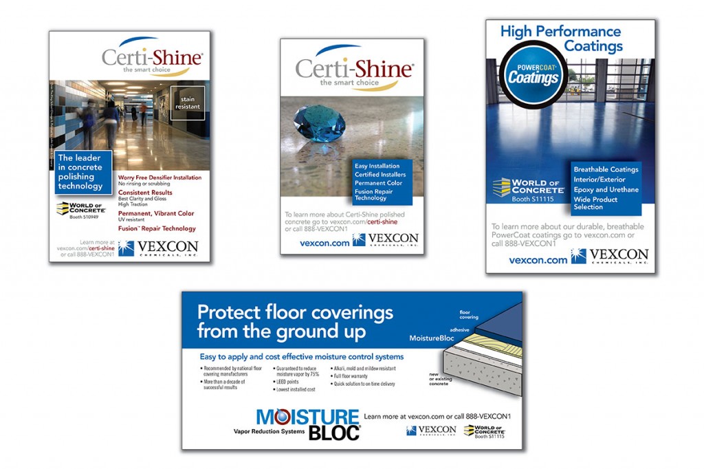
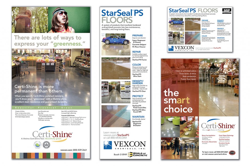
PRINT: We then redesigned all collateral, creating a general brochure for all product categories and a series of single page sell sheets by product line. Along with sales literature, we created a trade show booth and produced interactive video kiosks. Throughout the year, we produce ads for trade journals geared toward construction, design, and building professionals.
OUTCOME: a clean and clear pathway to connect the customer with the product or solution they need. By identifying the client’s role in the building trades, we successfully refine the options and present choices that they immediately understand and quickly decipher.